HOW TO CREATE A USER FRIENDLY NAVIGATION MENU

HOW IT WORKS
CREATE A POSITIVE USER EXPERIENCE WITH A CLEAN NAVIGATION MENU
WEBSITE NAVIGATION

1.Plan Ahead
A navigation bar full of random and seemingly unorganized links is the last thing you want on your web page – cluttered and seemingly senseless placement of navigation bar elements are a quick way to kill your conversion rate.
It’s always a good idea to plan ahead prior to creating your navigation bar. Think about what you want your website to offer its users and the order in which the information should be shown. Your navigation bar should be structured, well thought out, and easy to use.

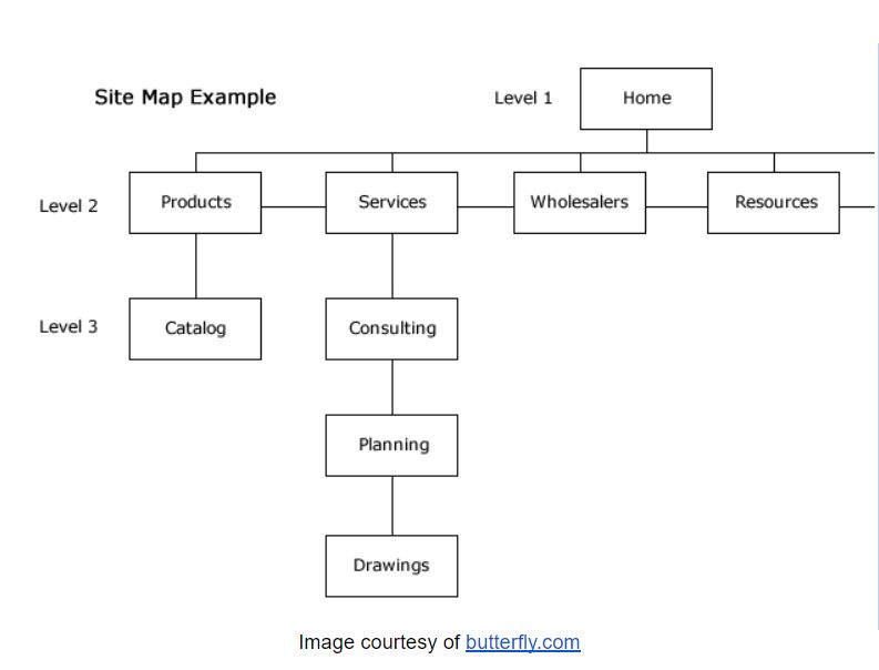
A website navigation bar in its early stages is referred to as a sitemap. Creating a sitemap is beneficial both to help you plan the structure of your website and to help Google understand your site’s content.
Try to group things together that are in the same category. This may seem obvious, but it is incredibly important. Our brains like to group things together because it helps us process information quickly. If you properly categorize and group elements in your navbar, it will make for a more intuitive user experience.
It’s also important to note that, with regards to menu navigation, there’s absolutely no need to reinvent the wheel. Traditional menu navigation works quite well, as it’s been tried and tested for years. Even if you were browsing through a website in a foreign language, you’d probably be able to find your way around simply because of your familiarity with most websites’ layouts. Often times if you try to do something new, you’ll just confuse your users and make things worse in the end.
Additionally, think about the placement of your primary navigation menu. Typically, navigation menus are either located at the top of a page or aligned to the left or the right of a page.
2. Simple Language
When you are planning the structure of your website’s navigation bar, don’t overlook the language and labeling you choose. With so many competitors on the web in every single niche, it’s easy to try and get clever to outsmart the competition – nevertheless, you can easily end up confusing your users rather than helping them, which is ultimately a detriment to your site’s conversion rate.
Your site should be simple and easy to understand, including your navigation bar and the language you choose for each element. Any link on your page that isn’t instantly understood needs to be changed – you shouldn’t refer to a shopping section of your page in the navigation bar as “retail” or “Merchandise”. Although it does make sense, most users are probably more familiar with the term “Shop”, and therefore it would be best to use that term. Remember, you want your users to immediately understand everything they’re seeing.
If you’d like to find out which words are best for your site, you can use A/B testing programs such as Crazy Egg to see which words users prefer to interact with.
Remember K.I.S.S., also known as keep it simple stupid! In general, a simple straightforward design is better than an elaborate and fancy navigation system with too many abstract words, unorganized groupings, and what seems like clutter everywhere.
3. Mega Menus
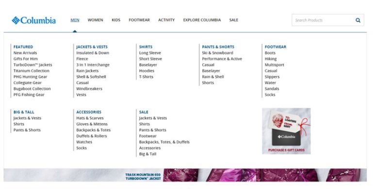
The profound effect of mega menus with drop-down options and simple menu navigation on the overall user experience can hardly be overstated. Mega menus are large navigation panels that commonly drop down when clicked, tapped, or hovered over.
They may not be the best idea to use for every single website, especially if you don’t have a whole lot of elements to include in the navigation bar. Nevertheless, mega menus can be a great fit for most sites, and they add to the user experience when done properly. A thoughtful, well-planned and designed mega menu can facilitate the exhibit of many different menu options all at once, without appearing overwhelming.

You can use icons, pictures, or structured typography to create your menu. Try to make them as scannable and intuitive to use as possible; this should be a general rule of thumb for your site in general, but it can be specifically applied to the creation of a mega menu.
If you have a retail site, in particular, mega menus could prove especially useful, in addition to sites with a gargantuan list of different services.
4. Responsive Rocks
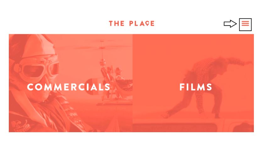
One of the most sure-fire ways to ensure your site looks great on any platform is through the use of a responsive website design. Using a responsive navigation bar style known as the ‘hamburger menu’ is a fantastic way to implement an interactive menu that works well on compact devices such as mobile phones.
Take a look:

Those three lines in the top right-hand corner of the web page turn into a menu when clicked or tapped. Oh, and it’s called a ‘hamburger menu’ because, well, someone decided the three lines look like a hamburger.
Optimizing your web page for mobile has never been more important – more than 50% of all Google searches are conducted from a mobile device, and Google is penalizing sites that don’t offer a mobile-friendly experience.
Although different depending on the site, typically hamburger menus slide down or pop up after the user clicks or taps on the icon. Interactive web designs are great for user retention and conversion rate, so it’s smart to use interactive elements when you can.
5. Sticky Navigation
Some websites are designed with a navigation bar that stays in place when you scroll down the page. Sites with small sitemaps are best suited for sticky menu styles, but if you get creative, a sticky menu can be implemented into any website.
Sticky menu navigation is great because your users can easily find their way around your website no matter where they are on any given page. It’s a nice feature that looks good and works well in terms of benefitting the user’s overall experience, and looking good too.


