DOES MOBILE DESIGN REALLY MATTER?

HOW IT WORKS
MOBILE USAGE WILL CONTINUE TO GROW & BECOME MORE RELEVANT TO YOUR BUSINESS
MOBILE FRIENDLY WEBSITE DESIGN
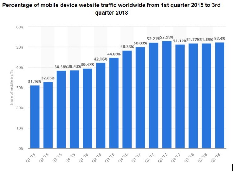 People spend more time on their mobile devices year after year. Considering more than half of Google’s user base are using their phones, they’re cracking down on pages that aren’t optimized for mobile users.
You ought to make sure your site’s design, structure, and speed are suitable for mobile devices, as to avoid losing mobile traffic. If your pages aren’t compliant with Google’s ‘mobile-first’ policy, Google will demote your rankings, resulting in less traffic on both desktop and mobile devices.
Luckily, your pages should all be optimized for Google’s ranking algorithm, so there are only a few tweaks you need to make to optimize for mobile as well.
Page speed is crucial – optimize your code, use browser caching, minimize page redirects, and be sure to compress images. All of these practices will help to ensure your page loads in a timely manner, which is great for desktop and especially mobile optimization.
On desktop, it is wise to place your most important content (conversion elements such as a call to action, contact form, etc.) above the fold. Most people don’t make it to the bottom of the page, so you’d be foolish to include your contact form there. However, on mobile devices, your site design should be a bit different. People scroll endlessly; in order to optimize your site’s design for mobile users, you can organize your content differently.
You should refrain from using certain features that are more acceptable on desktops, such as flash and pop-ups. Some phones may not support the flash plugin, and pop-ups can be far more annoying on a mobile device. Remember: content is king, and your main goal is to provide the user with a better experience than your competition.
Lastly, you’ll have to design between having one responsive site or setting up two, one for desktop and one for mobile. Both options have their pros and cons, but it’s important to note that Google prefers responsive websites, as opposed to static sites. Aside from boosting your rankings, responsive websites also engage your users, thus increasing dwell time and your site’s conversion rate.