VISUAL WEBSITE DESIGN

VISUAL WEBSITE DESIGN

CREATE VISUALLY APPEALING WEBSITES


HOW TO BUILD A BEAUTIFUL WEBSITE: 

Denver, Colorado 

Color plays a big part in web design – different colors express different emotions, and it is best to use the right color based on your target audience, depending on what you wish to communicate to them. For example, blues and light green colors convey trust, whereas dark colors such as red convey excitement.

Despite popular belief, website color schemes are not chosen arbitrarily; or at least, they shouldn’t be if you want to maximize trust, build rapport, and convert your visitors into paying customers.

Visually-Appealing-Website-My-Denver-Digital-

HOW IT WORKS

BELIEVE IT OR NOT, DIFFERENT COLORS HAVE DIFFERENT EFFECTS ON OUR EMOTIONS.

VISUALLY APPEALING WEBSITE DESIGN
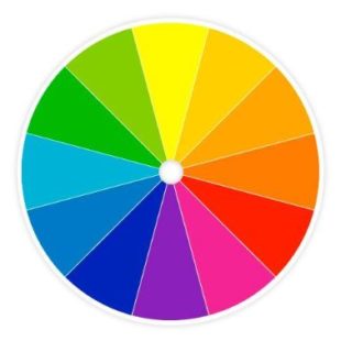
  • Red: power, importance, youth
  • Orange: friendliness, energy, uniqueness
  • Yellow: Happiness, enthusiasm, antiquity
  • Green: Growth, stability, financial themes, environmental themes
  • Blue: Calm, safety, openness (lighter shades), reliability (darker shades)
  • Purple: Luxury, romance (lighter shades), mystery (darker shades)
  • Black: Power, edginess, sophistication
  • White: Cleanness, virtue, simplicity
Color-Wheel-My-Denver-Digital-Website-Design-Company

Now let’s go a bit more in-depth:

  • Complementation is the way people see colors – more specifically, how colors look when placed in conjunction with one another.

The colors across from one another are complimentary colors, and they are visually pleasing when paired because they contrast well. If you utilize complementation properly, your website will smoke the competition.  

  • Contrast helps to minimize the strain on the eye, and it helps people focus their attention on the right elements on the web page. Keep text legible by using dark text color and a light background.

Aside from helping people to clearly understand the content of a web page, using contrast can help draw attention to a call to action button, which is crucial for lead generation and conversion.

  • Vibrancy has to do with the amount of excitement and emotion of your design. Bright colors are more vibrant and tend to convey more upbeat positive energy, whereas darker colors are more mysterious and relaxing.
BEST WAYS TO USE COLOR

Aside from using color and emotions to your advantage, you also need to understand that the importance of contrast cannot be overstated. Text especially should be easily readable, distinct, and clear. Don’t overthink things – when it comes to SEO and overall web development, content is king. The color on your website should not distract your viewers from the page’s actual content, but rather the color should act as a nice compliment.

The first step in creating a business is figuring out whether or not your target market is actually willing to pay for your product. Needless to say, it’s important to know your target audience. The same goes for website design – you need to know who (in general) will be frequenting your website so that you can use the right colors to target them accordingly.

You should think about demographics, and which feelings you want to convey. 

PRO TIP-Color plays a decisive role in the development of a web page. The color scheme you chose will affect how users feel while interacting with your page, and it will have a notable impact on your conversion rate, so you ought to make sure you choose your color scheme wisely!

Voted Denver’s Best Digital Marketing Agency in 2018, 2019, 2020 & 2023