“IF YOU CAN DREAM IT, WE CAN BUILD IT”
MOBILE FRIENDLY WEBSITE DESIGN
2. Keep it Simple
According to Hick’s Law, as you increase the number of choices someone has, they will take longer to make a decision logarithmically.
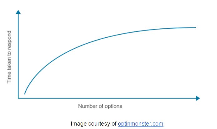
You want to convert your traffic as quickly as possible, which means you need to keep it simple. Despite your urge to create a fancy, extravagant web page, it’s actually more advantageous to minimize the number of decisions your users have to make. They should be doing as little thinking as possible before deciding to become a paying customer.
Consider Amazon’s product overview page, for instance:
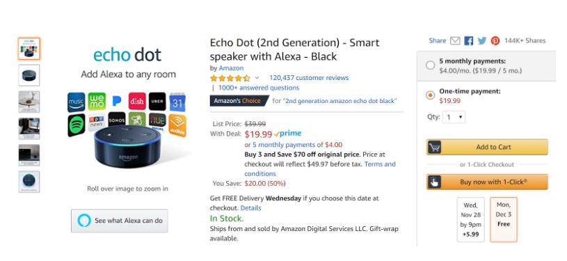
Notice how everything is laid out on the page – Amazon has spent a lot of time and money figuring out the best way to convert their customers. You’ll notice their ‘Add to Cart’ and ‘Buy now with 1-Click’ buttons are large, colorful, and easy to see.
Their ‘Buy now with 1-Click’ significantly increases conversions, because it stands out, it’s straightforward, and it allows their users to make a purchase instantaneously. Whether you’re selling a product or prompting someone to sign up for your mailing list, your call to action button should be at the forefront of your page, demanding attention from visitors.
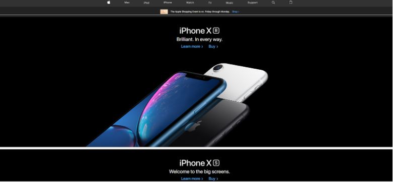 Apple’s website is another phenomenal example:
There’s nothing fancy here; only a nav bar, an eye-catching image, and a call to action. Their home page is elegant, sleek, and most important of all, it’s simple.
3. Don’t Keep Them Waiting
As mentioned previously, people lose patience quickly, especially when it comes to web browsing. Even a one-second delay can result in a 7% reduction in conversions. Needless to say, you ought to make sure your pages load as quickly as possible.
Optimizing images is one of the quickest and most effective ways to speed up your page, as they are responsible for the majority of page data. You can use online image compressors like Kraken.io to quickly optimize images and reduce loading times.
You can also use Google Page Speed Insights to test the speed of your web pages. It is a helpful tool that diagnoses issues slowing down your site, thus harming the user experience. It even presents you with solutions to the problems!
4. Grouping and Placement
People read websites in a T-shaped fashion. When they first look at a website, their eyes initially look at the top left of the page, which is why most websites place their logo there. Next, most people tend to look at the middle of the page, which is why it’s important to place your big call to action there. Lastly, they scroll down with their eyes, and they finish on the right-hand side of the page, towards the top. This is where you should place your phone number.
It’s also important to note that the human brain likes to group similar things together. You can use this to your advantage when it comes to it comes to web development and conversions. Simply group things together that you want your users to associate as one.
For example, it would be wise to place a testimonial box close to your call to action. Doing so will build trust with your users and they’ll be far more likely to click your call to action. As discussed in the previous point, people have very short attention spans, so you don’t want to keep them waiting. By grouping similar things together that you’d like your users to associate with one another, you’ll help them process the information faster, thus boosting your conversion rate.
5. Don’t Be Afraid of White Space
Web designers often refer to white space as negative space; anywhere on a web page without an element is considered negative space. Implementing white space is crucial for conversions – you should also realize that white space doesn’t just refer to space between large images or headings on your web page, but also space in between paragraphs, lines, and even characters.
Properly spacing the elements of your web page – including the distance between lines and characters – helps users process the information, and skim through your page (which is how most people read a web page, by the way).
Apple’s home page is another great example of using negative space. Most of their home page consists of negative space, which causes the user’s attention to be drawn only to their product and their call to action. Remember, simple is best.
6. Color Matters
The best looking websites have great color schemes – while the use of color plays an important role when it comes to the overall design of your site, color can also be used to send hidden messages to your users’ unconscious mind.
Different colors’ effects on the brain according to TNW:
- Red: power, importance, youth
- Orange: friendliness, energy, uniqueness
- Yellow: Happiness, enthusiasm, antiquity
- Green: Growth, stability, financial themes, environmental themes
- Blue: Calm, safety, openness (lighter shades), reliability (darker shades)
- Purple: Luxury, romance (lighter shades), mystery (darker shades)
- Black: Power, edginess, sophistication
- White: Cleanness, virtue, simplicity
You should consider your website’s niche and the emotions each color invokes before deciding on a color scheme. Additionally, it’s imperative to use contrasting colors when designing your web page.
Take a look at the color wheel:
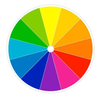
Colors that are across from each other on the color wheel are known as complementary colors, and they tend to pair well when you want to use contrasting colors. If your call to action button stands out, people’s eyes will automatically be drawn to it. Using a contrasting color for a call to action button is a superb way to boost your conversion rate.
Remember to keep your font and button colors in contrast with the negative space on your site, and the things you want to highlight (call to action buttons, contact forms, etc). Color can make or break a website, and they’re even more important when it comes to conversion.
Take a look at Evernote’s home page:
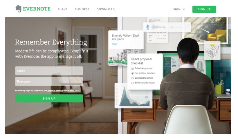
Notice their green ‘Sign Up’ call to action button is bright, vibrant, and it contrasts the rest of the color on the page. You can’t help but look at it immediately!
7. Quality is Key
You’ll want to source the highest quality images for your web page. You can find plenty of suitable images on stock image sites that will look great on your site, regardless of your niche. People are far more likely to be interested in – and trusting of – a website with high-quality images.
Avoid dull and low-quality images. If possible, try to include images with human faces. People like to see faces, as they are familiar and help to build trust with the user. If you’re the face of your brand, feel free to include a photo of you. If not, you can always pull images from stock photo sites, as stated above.
At the end of the day, ensuring that your page is of the highest possible quality is the most important thing you can do to optimize your web page for conversions.


 Thanks to modern technology, it’s never been easier to contact a friend on the other side of the globe. The first airplane took flight in 1903 – nowadays, people complain about having slow WiFi connection while flying in a plane over the Atlantic ocean. Needless to say, in our increasingly interconnected society, people have grown accustomed to instantaneous gratification.